
iRiS
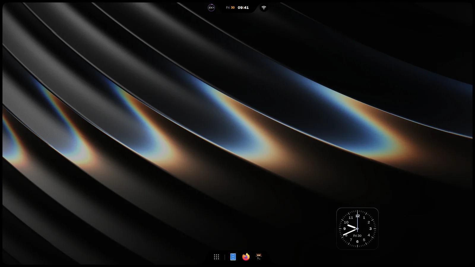
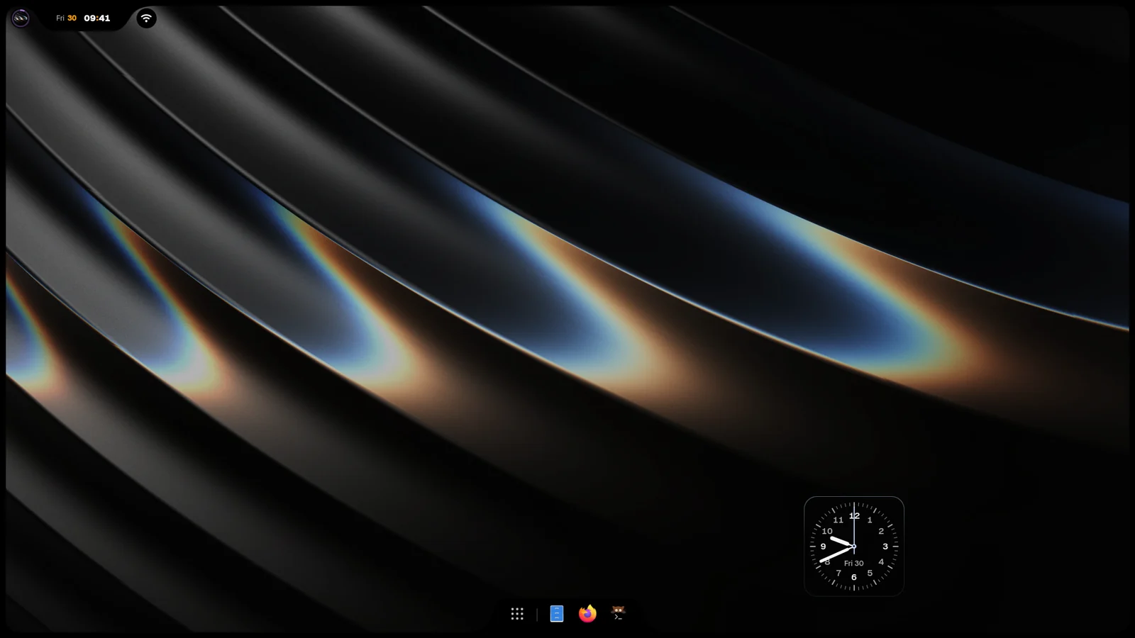
iRiS is the Island family. One Island sits on a screen edge and grows into whatever you open, while the Dock, the pieces and the desktop widgets follow the same look.
The Island
Section titled “The Island”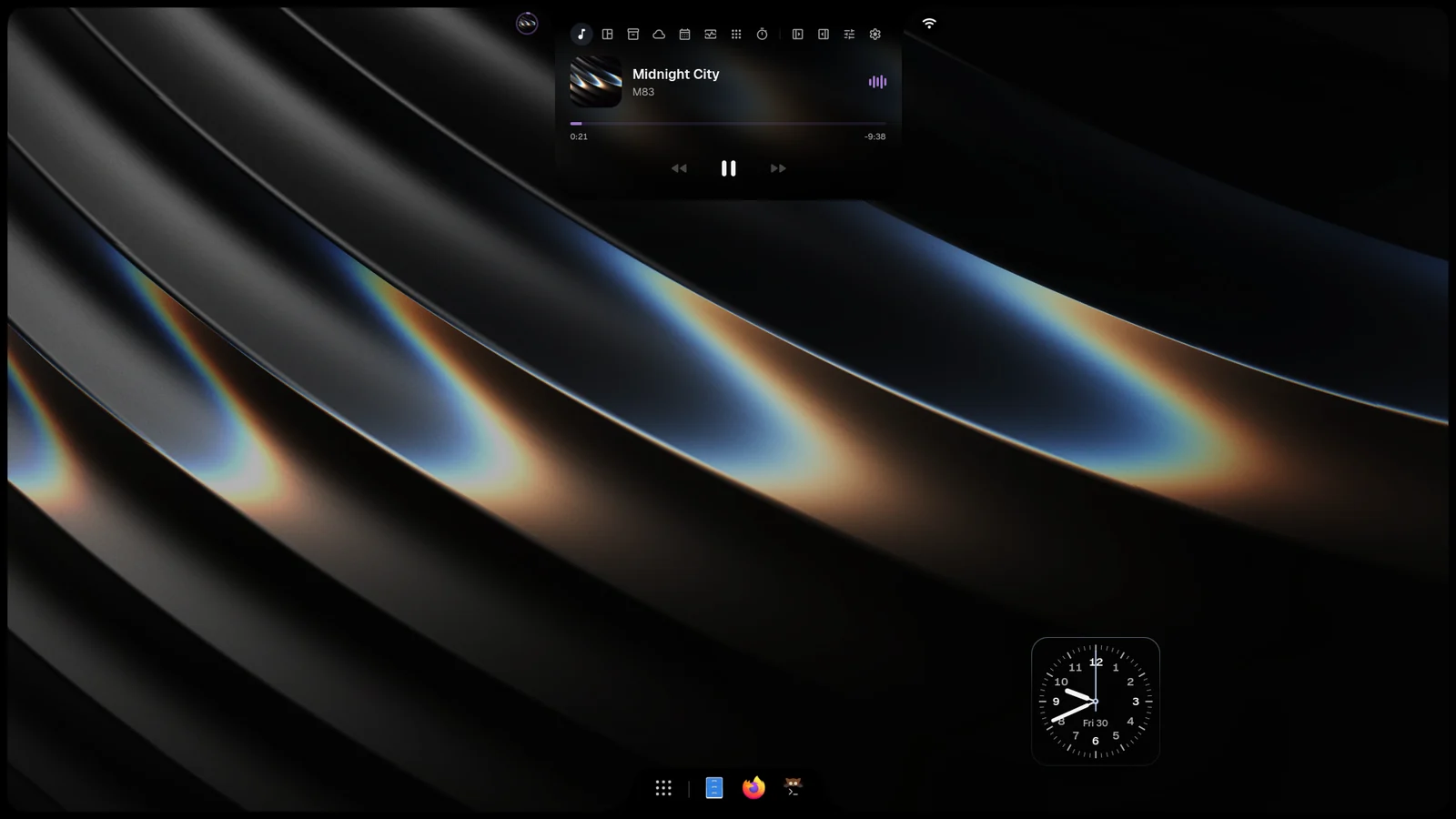
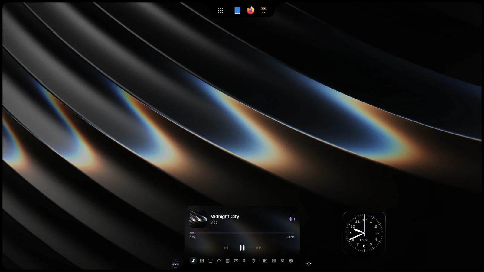
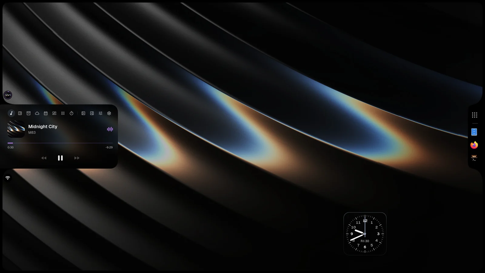
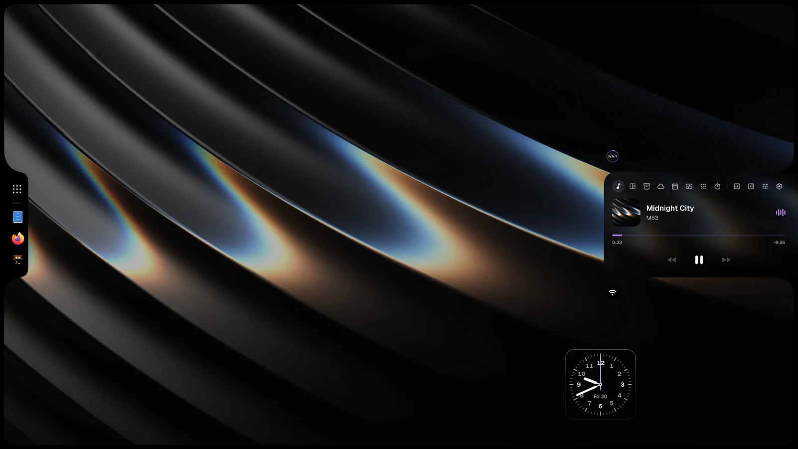
- It rests on the top, bottom, left or right edge: iRiS Settings›Island›Layout›Screen edge.
- It opens into pages for music, activity, the shelf, the desktop and more.
- Island layout (Settings›Island›Layout›Island layout):
- Island keeps it in the middle of the edge.
- Corner left and Corner right dock it in one corner, melted into both walls.
- Shelf spans the whole edge, the Island rising from it.
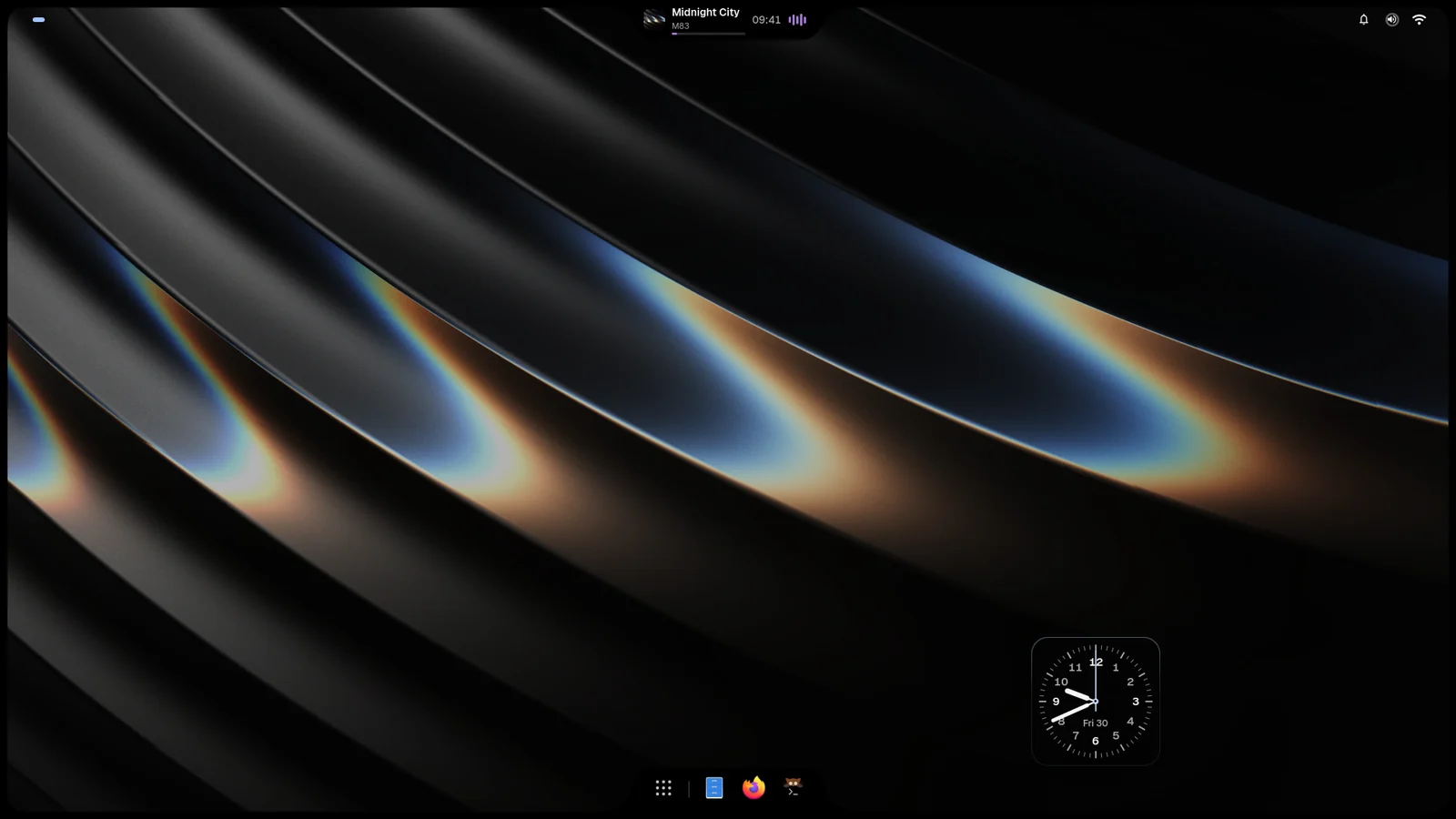
- Pods sets three bodies on one line that melt where they meet.
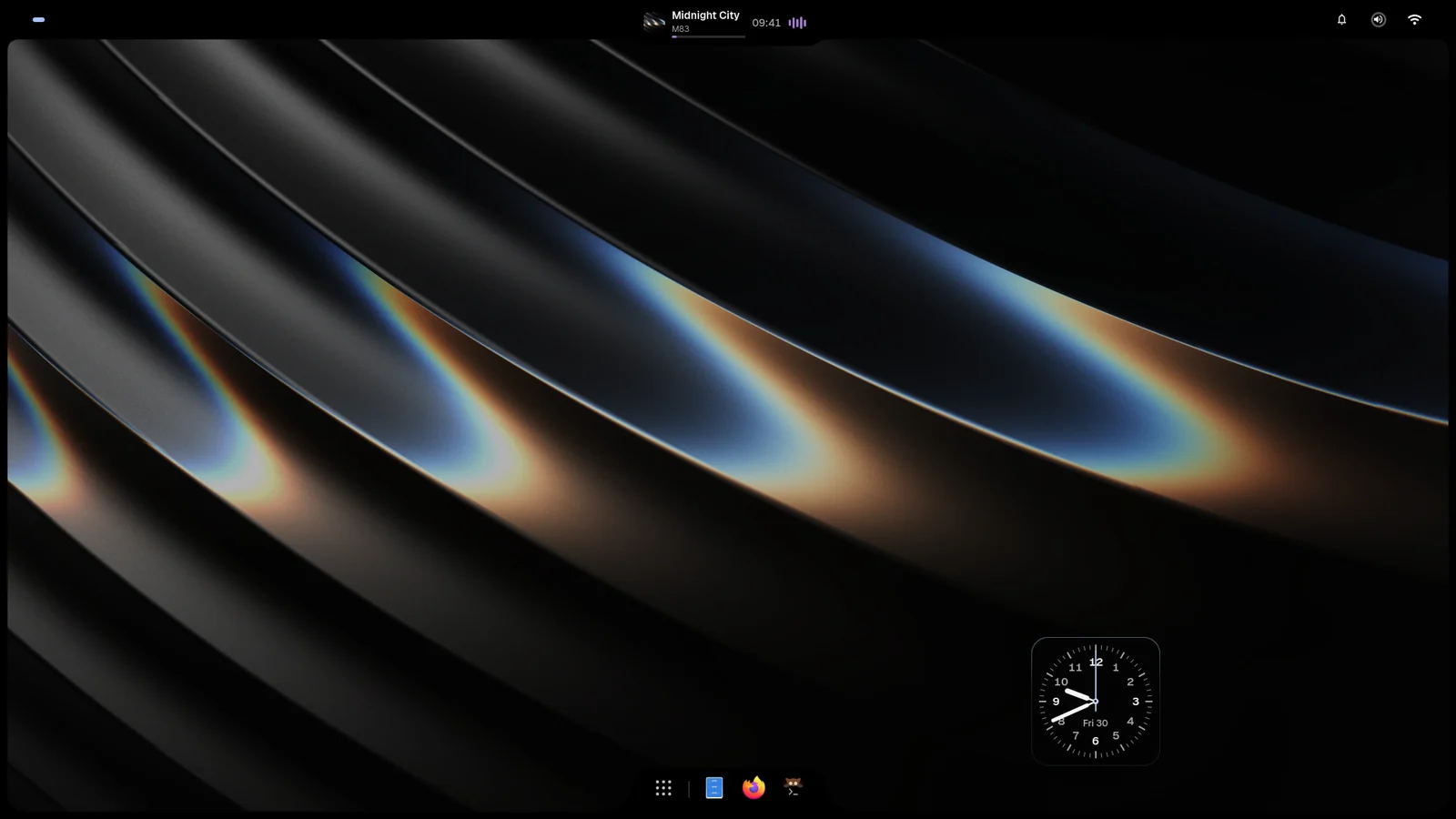
- Menu bar makes a thin strip with the Island hanging from it as a notch. Its strip is Transparent or Band (Menu bar strip).
- The Island design you wear shows in every layout, Halo included. While a song plays, its cover and its moving bars sit at the design’s sides, as on Apple’s Dynamic Island, and the design stays in the middle; paused, the cover dims and stays.
- Island shape (Settings›Island›Shape›Island shape): Auto, Round, Squircle or Square.
- Island design (Settings › Island › Design and modes) sets how the resting Island looks: each design is shown alive in a small Island before you pick it. Composition and Island layout live in the same group. Besides Halo, Ledger, Tiles, Dial, Marquee and Duo:
- Headline: the time tall and condensed like a poster, beside the place, the sky and the temperature.
- Rings: three rings for the day gone, the battery (the week on a desktop) and the month, beside the time.
- Aura: the Island ringed in the colours of the spectrum; they turn once when the pointer is over it.
- Comet: one light runs round the rim with its tail fading behind it. Where its head stands counts the hour, the day or the battery, read clockwise from the top. It moves once a minute and runs a lap while the pointer is over the Island.
- Lumen: the rim lit from below in two colours, like a lamp under glass, with a little of the light pooled at its foot. The light says something: the battery (its colour, and how far up the sides it climbs as it charges) or the hour’s sky. Under the pointer, and once when the charger goes in, it climbs the whole rim.
- Glyph: lamps set into the rim, as on the back of a Nothing Phone, each read by how far it is lit: the battery along the foot (the hour on a machine without one), the notifications waiting up the left side, the next event closing in over its last hour up the right. Plugged in, the foot counts up to the charge and the percentage rides beside the time.
- Tide: the Island holds water up to the battery’s charge (or the hour gone, or the day gone), the time over it. Still at rest; when the charger goes in it rises from empty and rolls, under the pointer it sloshes. Low, the water turns the danger colour; charging, green.
- Status: a status bar: the time, the connection (cable, Wi-Fi bars or none), a red mark when the sound is off, and the battery with its figure. Without a battery it shows a connected headset’s charge, else the weather, else the day.
- Forecast: the time, then the next hours the way a weather app lays them out: now first, each hour its sky in colour and its temperature. It moves on once an hour. Without weather it shows the day.
- World: the time here and in another city: a small watch with a light face by day and a dark one by night, the city’s name over its time, how many hours apart it is, and a +1 when it is already tomorrow there.
- Settings › Island › Face holds the options of the design you wear, and only those:
- Ledger: how far ahead it looks for the next event (3, 12 or 24 hours).
- Tiles: which tile is lit (the hour, the minutes or both) and whether the day sits beside them.
- Dial: the marks round the watch (every hour, quarters or none) and what sits beside it (the day, the time in figures or nothing).
- Marquee: whether the next event, the weather and the sunrise or sunset take their turn; the date always stays.
- Duo: whether the temperature shows in the window’s corner.
- Headline: the place and the sky, or the day and the date, beside the time; and the temperature at the end.
- Rings: what each ring counts: the day, the week, the month, the year or the battery.
- Aura: its colours (Spectrum, your accent, the day’s sky, the wallpaper, Sunset, Ocean or Mint) and whether they turn under the pointer.
- Comet: what its head counts (the hour, the day or the battery), a Tail behind it or the whole Track lit, the same colours as Aura, and the lap under the pointer.
- Lumen: what its light tells (the battery, the sky or one of Aura’s colours) and the light at its foot.
- Glyph: what the foot counts (the battery or the hour), the notifications and event lamps, and the charge in figures.
- Tide: what the water stands at (the battery, the hour or the day) and the charge in figures.
- Status: what its capsule carries (Auto, the battery, a headset, the sky or the day), the connection mark and the red sound-off mark.
- Forecast: how many hours it shows (2, 3 or 4, now included; a narrow Island shows fewer), each hour’s name, and the sky in colour or in grey.
- World: the city (50 to pick from, searchable), a second city beside it, the hours apart and the small watch. Short of room the hours apart step out first, then the watches, then the second city, so no name or time is ever cut.
- Halo: Sunlight, its glow where the sun stands.
- Live activities look like a phone’s Dynamic Island:
- Music opens into a player with the cover, the song and its artist (a long name slides through instead of being cut), the time on both sides of the bar and large play controls. The mark at the right of the controls is where the sound goes (earbuds, headphones, a screen, or the output picker for speakers); click it for the Sound card and its devices. It is not there when the computer has no sound output.
- Timers show an orange ring that empties as the time runs; open, they have round pause and close buttons, and a pomodoro shows each focus and break as a segment.
- Downloads and tasks show a ring with their percentage.
- Settings › Island › Live activities has a switch for each kind that may take the Island: screen recording, timers, downloads and tasks, camera, calls and music. With Camera or Calls off, the privacy dot still shows while an app uses them. Microphone glow lights the screen’s edges for a moment when an app starts listening; it is off from the start.
- Order lists the same kinds first to last: drag one to move it. When several run at once, the first takes the Island and the next waits in the bubble beside it. A kind switched off keeps its place, greyed. Under Cluster the song stays in its bubble wherever it stands.
- Settings›Island›Layout › Size sets the Island’s height, clock size and breathing room together: Compact, Regular or Large. Height, Clock size and Breathing room still fine-tune each one; a larger clock widens the resting Island with it.
- The Weather page shows the temperature large, the place and the sky, and the next hours on a bar and as coloured columns by how warm each hour is.
- The Vitals page shows processor, memory, heat and disk as four rings, and the processor over the last minute as a chart.
- Notices: the Island says by itself what just happened, for a moment (Settings›Island›Notices):
- Size: Compact is a line in the resting Island (on a full-width bar or a menu bar it hangs under the strip); Large grows the Island into a card, as a phone’s alerts do. On a side edge it stays a line.
- Stays for sets how long a notice holds the Island, from 1.5 to 8 seconds. See one shows a notice with what you chose, and every switch shows its own notice as you turn it on.
- Under Fine-tune each kind has its switch: unlock (a face drawn in green), Silent (a red pill when the sound is muted from anywhere), Do not disturb, low battery, screenshots (the picture itself; a click opens it), recordings with their length, upcoming events (a ring closing on the event, first said 10, 5 or 1 minute before), rain and snow on the way, timers and each focus or break, finished downloads, copies and updates, what you keep on the Shelf, an error in Niri’s config, and loud jumps in volume held back.
- A percentage shows only for a level (a headset’s charge, the battery); an event or a finished job shows its ring.
- While the camera is on, the Island shows a green camera tile with the app.
- When an app starts using the microphone, the edges of the screen glow in colour for three seconds.
- While an app uses the microphone (a call), the Island shows a green handset, how long the call has run and the sound moving.
- Notifications open from the Island as a phone’s do: the picture or app round at the start, the app small over the title. Two answers that refuse and take (a call, an invite) are a red and a green button; other answers are capsules, the last one filled. Apps that take a written answer show Reply: type and press Enter.
- With more than one player, dots under the controls switch between them; a swipe on the cover or the wheel sideways does too, and a click on the cover brings the app forward.
- The Bluetooth card shows the charge of every connected device as a gauge with its name.
- The calendar shows the next thing today on a coloured band with how long until it, and each entry with its colour and how far off it is.
- The Desktop page has a Workspaces block (Settings›Island›Desktop page›Blocks): this screen’s workspaces as cards, each with its windows’ icons, its name and what holds it. A tap goes there, the key on a card brings the focused window to it, and the round key at the end opens the overview. More cards than fit scroll sideways.
Pieces and the Dock
Section titled “Pieces and the Dock”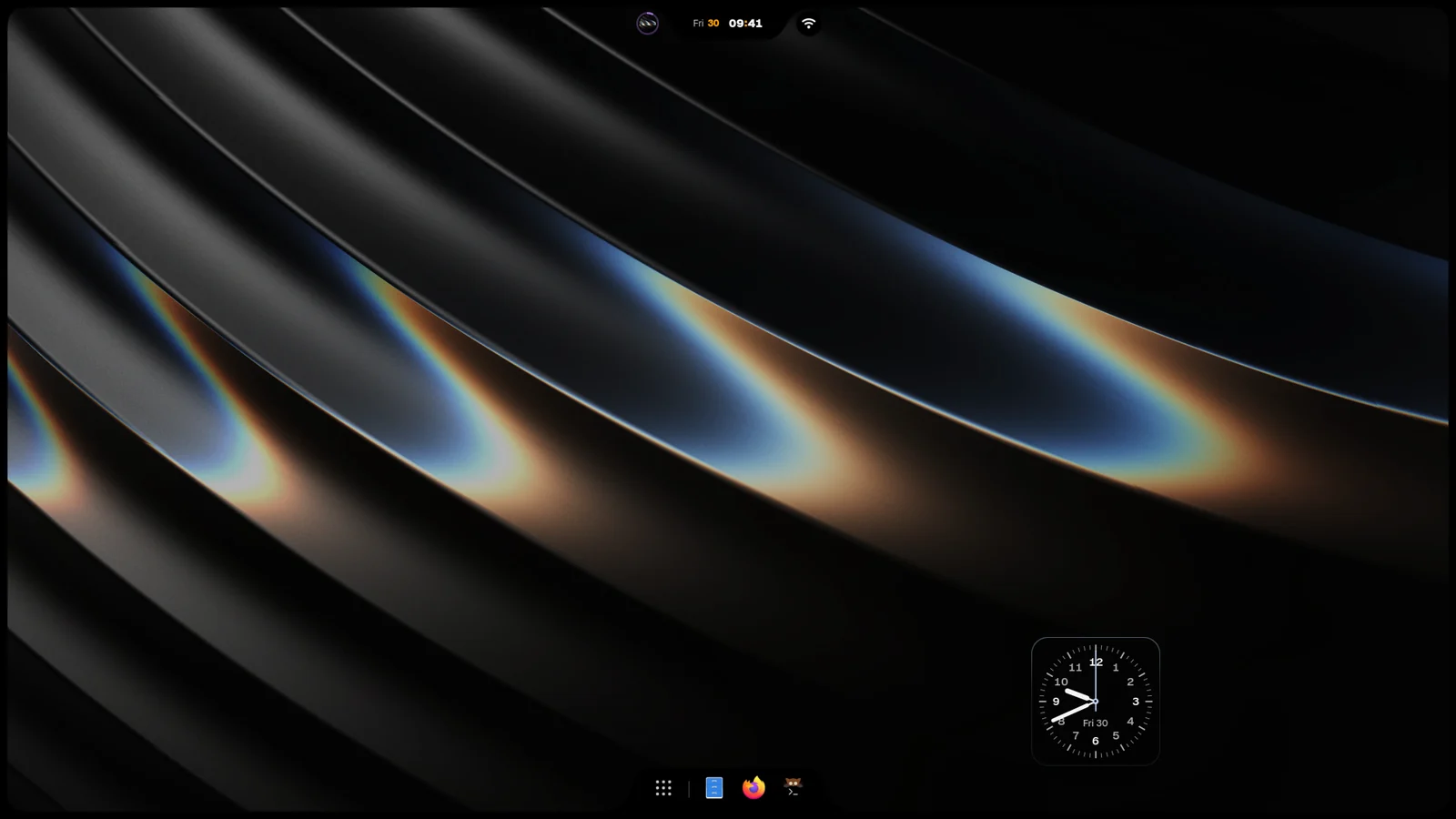
Pieces are the small things around the Island: weather, notifications, sound, the microphone, timers, Now Playing, the tray, calendar, battery, network, vitals and more. Each piece has its own switch and a spot under Settings›Bubbles & Cards›Extra bubbles. The spots are the four corners, the left and right edges, or Free, which floats it on the desktop.
You can also move a bubble by holding it and dragging. Rings show where it can go: one at the end of each line, one where two lines start from the same empty corner, and one on the Island. A corner has two lines running out of its curve, one along the top or bottom and one down or up the side, and together they make one shape with the frame: the side line carries on from the corner’s bubble, on its axis and at a line’s spacing, so a bubble above, below or beside another joins it as one body, never two with a bulge each. Over a line, the line opens a gap where the bubble would land, and you can drop it before, between or after the bubbles there; that order is kept. With Settings › Bubbles › Snap to corners and edges off, only the Island takes it and it otherwise stays where you let go.
The Dock is set under iRiS Settings›Dock:
- Visibility: Show dock, Automatically hide, Reserve space for windows, Stay visible on empty workspaces.
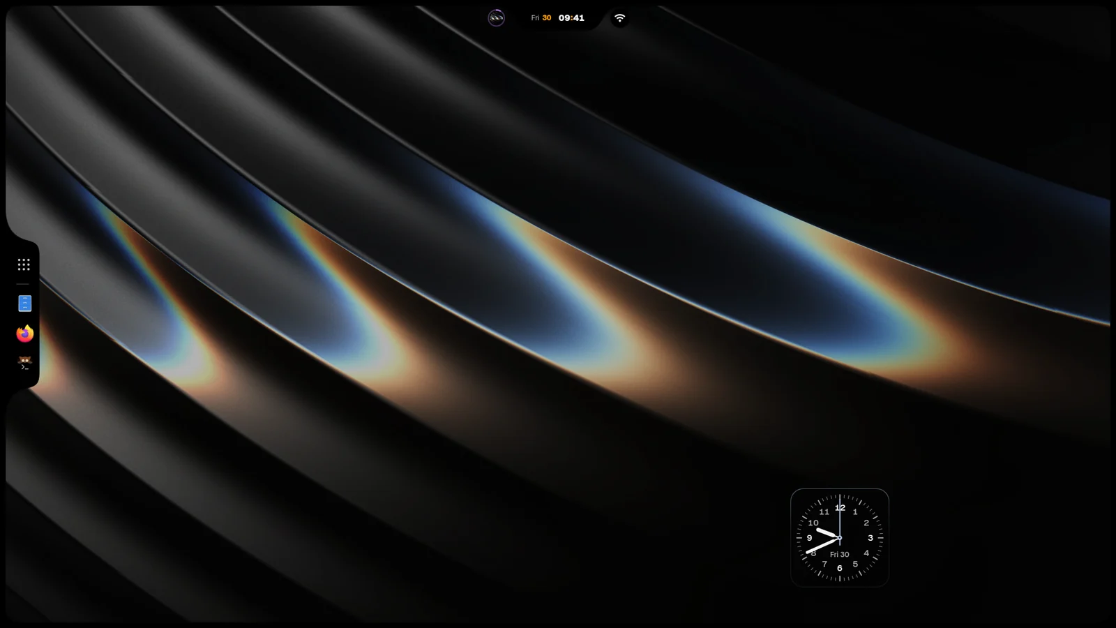
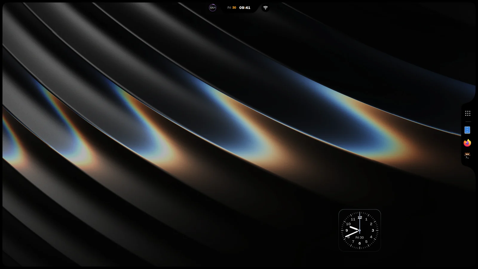
- Look › Screen edge: Auto puts it on the edge opposite the Island, or pick Top, Bottom, Left or Right.
- Look › Material: iRiS, Solid, Glass or Blur (beta). The factory is flat: every panel is plain black (or paper in light mode), with cards a breath lighter than the panel. Glass blurs your wallpaper and costs little; Blur needs Niri 26.04 or later and asks Niri to blur whatever is behind on every frame, which weaker GPUs feel. Where Niri cannot blur, Blur stays flat.
- Look › Material › Frame light: Plain or Holo. Holo lights the frame like the back of a CD: a pastel spectral rim on the frame’s inner line that turns with the angle round the screen, and a soft halo over the screen’s edge. It is light, not a material, so it works with Flat, Solid, Glass, Blur and every texture, dark or light. Holo light sets its brightness and Holo halo how far it spills over the screen (0 keeps it on the frame).
- Surfaces › Frame › Rail: None, Left or Right. The frame grows wide on that side and holds the Dock, like a browser’s sidebar: the launcher at the top, your apps below it with the focused one on a lit plate, + (pin apps) after them and Settings at the bottom. The content’s corners round into it the way they round into the frame. The rail is always shown and windows stay clear of it, so while it is on, the Dock’s screen edge, hiding and magnification rows leave Settings. It needs the frame and the Dock on; on the Island’s side it stays off. Fullscreen hides it with the frame. Rail width sets how wide it stands (its icons grow with it; in Customize, drag its inner edge), Rail apps lines them up at the Top like a browser’s tabs or holds them in the Centre like a Dock, and Rail buttons shows or hides the + and the gear. Side panels open beside it.
- Apps: Pinned apps, Open apps and Drag to reorder. Drag an icon along the Dock to reorder it; Esc while dragging puts it back.
Look, colour and themes
Section titled “Look, colour and themes”- Style › Material: the surface under every iRiS panel. Black, Graphite, Midnight, Wallpaper or Theme.
- Style › Texture: how every body is drawn, in iRiS and AIRISU alike. Flat, the default, is a plain plate; Ricelin a card lit from above, Aurora thin and translucent, Angel a bright glass edge, Regalia a solid tile; Afterglow, Light leak and Light streak bring their own light. Light streak lights everything from under the Island: a hot line on every edge that faces it, your colours rising off those edges like an aurora (Aurora, Your colours or Wallpaper), and a trail behind whatever moves; Light, Aurora and Trails set how much of each.
- Colour › Look: Apple, Nothing OS, Synth or Gel.
- Colour › Scheme: Auto, Dark mode, Ink or Light mode. Ink sits between dark and light, like paper and ink.
- Style › Colour theme: Catppuccin, Rosé Pine, Tokyo Night, Nord and more. Match the shell also gives iRiS the theme’s accent, highlight and material.
- Style › Design: iRiS, or a Design from the Hub. A Design is another iRiS: its own colour, type, corners, edges, shadow and motion, and the Island’s face at rest, over the same panels; nothing moves and nothing changes what it does. The last tile, More in the Hub, lists the Designs you can install. While you wear one, the rows it decides leave Settings; take it off (pick iRiS) or remove it, and your own look is back as you left it. AIRISU is the first: iRiS in lacquer, whose Island stamps the day as a seal beside the leaning hour.
- Style › Presets: the first tile on Style, beside Design and Look (the three picks that change everything). It says which look you wear; open it for every curated look as a little widget of itself (its plate, its accent, its type, its colours as a strip): one click puts the whole look on, Undo takes it back. Colour lives on Style too, in its own band, then Material, Shape and type, More. Use Customize, Themes, Save current to keep the look you have as your own theme.
- Customize: right-click the desktop and pick Customize iRiS. The Island grows a capsule with Themes, Look and Pieces, plus undo, redo and Done.
- Style › Customize opens: On the shell, which edits in place, or Studio, a side panel with search.
- Style › Icons: iRiS draws every mark as its widgets head themselves, the glyph alone in its area’s colour; Icon pack brings back plates (iRiS) or app tiles. Icons › Colour: Areas colours by family. Each sidebar group has its own band: Appearance violets, Island to Control Center blues, Spotlight to Anime greens, Notifications to Login warm, Home and the foot grey. Accent paints every icon your accent; Mono keeps them grey.
- Home › Every day: the Edit button on its title picks which settings Home pins.
- Lists in Settings give a little at their ends, with a mouse wheel too, and spring back.
- Colour layer (Settings›Anime): the Anime colour layer switch, then Palette (Sakura, Neo Tokyo, Unit-01, Magical Girl or Spirit Forest), Strength (0 keeps your own accent, 100 is the full palette) and Recolour the highlight.
- Airing (Settings›Anime›Airing): the Airing bubble switch, and how many episodes its card lists, from 3 to 8.
- Continue (Settings›Anime›Continue): watch anime without a terminal. It needs
ani-cli, and the row says so when it is missing. Set Audio (Subtitled or Dubbed), Quality (Best, 1080p, 720p or 480p), Subtitle size, Subtitle height and Skip intros here.
Wallpaper, desktop and Spotlight
Section titled “Wallpaper, desktop and Spotlight”- Wallpaper › Wallpaper gallery › Picker: Gallery is iRiS’s own, out of the Island; Grid, Coverflow and Launcher open Material’s pickers instead, from the same shortcut, piece or Island button.
- Wallpaper › Wallpaper gallery › Live wallpaper downloads: Best takes the 4K file when there is one, Light takes HD.
- Desktop widgets rest a little inside the frame (or the screen edge without one) and settle into its corners with the same gap.
- Desktop › Widgets › Design › Prism dresses every widget as the Now Playing Prism: a folder of frosted glass whose dark tab names what the widget is about in its colour, a flap lit in that colour holding one fact, a clear pane across the folder with the thing itself, a beam of white light breaking at the pane’s foot, and the details at its foot. Every widget has one: clock, date, day, world clock, weather, uptime, screen time, vitals, controls, timers, month, up next, tasks, notes, news, palette, profile, batteries, lyrics and photo. A switch the machine has no hardware for (Wi-Fi, Bluetooth, a microphone) is not drawn. Each widget picks how much of Prism it wears in its quick controls › Look › Prism: Quiet (one slab of smoked glass, the spectrum only on its data; the default), Beam (a beam of white light crossing it) or Folder (the folder above). Prism’s light is your accent’s: the beam’s spectrum, the glints on a slab’s rim and the colours on a widget’s figures and traces run soft and even, their strongest band nearest your accent, a little deeper in light mode. Nothing glows around a Prism widget; Look › Shadow gives it a shadow on the desktop, from 0 % (none, the default) to 100 %. Each widget can wear another design from its quick controls.
- Widget quick controls (the slider key on a widget while arranging) speak Settings’ Prism language: Widget (sizes drawn as cells, scale and the widget’s own options as numbered rows), Look (each design drawn as a card, the background, corners and surface opacity), Arrange (position on a 3x3 grid, lock, bring to front, reset, remove). The keys over a selected widget pick a size in one tap.
- Widgets have a second way to read in their sheet, under Face:
- Clock: Hour (the time as large as the plate lets it, over the day as one line with sunrise and sunset) or Greeting (the time, the date, and a word for the part of the day with the temperature beside it).
- Calendar: Week (today and the days ahead as columns, events where they fall).
- Vitals: Bars (every reading a meter, the highest leads).
- Screen Time: Ribbon (the 24 hours, each coloured by the app that held it).
- Weather: Week (now beside its sky, then the coming days as columns, each its sky and its high over its low; today on its own plate).
- Battery: Cells (the charge as a battery of cells, the one filling breathes while it charges; other devices under it with their own small cells).
- Controls (medium and large): Discs (round keys four a row, each its name under it, lit in its colour when on; ink under Nothing).
- Tasks: Progress (what is done out of all of it as the figure, and a segment per task that fills as you tick it; past twelve tasks one bar).
- World clock: Offset (one city leads with how far its clock stands from yours as the figure, its time and day under it, and a ruler of the 24 hours around your now with the city’s time as far along as it runs ahead or behind; tap for the next city, and on large tap any city in the list).
- Now Playing (medium and large): Prism (a folder of frosted glass: the player’s mark and name on its dark tab, the hour on a shorter flap lit in the song’s colour, and a pane laid across it with the cover, the song’s state and, on large, the line being sung, or the song’s bars and album without lyrics; a beam of white light enters from the left and breaks on the cover into its spectrum, brighter while the song plays; then the title, the artist, the timeline and the keys, play in the song’s colour; a long title slides through once when the song changes and while the pointer is on it); or Vinyl: the cover is the sleeve and the record rides behind it, sliding half out and turning while the song plays, its label the cover, and slipping back in when you pause.
- Under Colour › Look › Nothing OS, Figures draws large numbers as Nothing’s dot matrix (the default) or in Archivo’s wide figures.
- Arranging the desktop, a widget’s sheet has three pages: Widget (what it shows), Look (background, corners, ink) and Arrange (scale, position, lock). The background key on the widget’s capsule and Look › Surface are the same switch: None takes the plate off, Glass, Solid and Tinted say what it is made of, and Shared follows Style › Widgets.
- Side Panels: pick Focus or Today and the page shows that panel’s sections, width, height and look, with the panel itself on the stage. Sections are a list you reorder right there.
- Desktop › Widgets › Lume on every widget: every widget’s text reads as if the wallpaper behind it were bright and busy.
- Spotlight: type
/to list iRiS’s own switches, including Frame Music and Edge Music.
Lock, capture, windows, Spotlight and Now Playing
Section titled “Lock, capture, windows, Spotlight and Now Playing”- Lock Screen: what it shows (scene, clock, at a glance, now playing, activity), how you sign in and when it locks on its own (Security, When idle). Super+Alt+L locks.
- Screenshots & Recording: Super+Shift+S opens the snip; the page sets the snip, Read text (the language it reads), recording and the Japanese lookup.
- Windows: Niri’s gaps, borders, corners and movement, the glass behind apps and the room windows leave for iRiS.
- Spotlight: search for apps, files, the clipboard and more; the page sets results, the clipboard, prefixes and web search.
- Now Playing: music on the Island, the lock screen and the frame: Frame music, the edge wave, the bubble, song naming, the visualizer and the player.
Settings
Section titled “Settings”Open Settings with Super+,. It opens as Prism: a dark panel in three columns, and every area of iRiS Settings is a page of it. On the left, the window’s lights (red closes it; yellow puts it away, and as a window minimizes it to the Dock until you open Settings again; green gives it the whole screen), the search and every page by group (Shell, Desktop, Tools, System, iNiR), then the rows you pinned. The page you open unfolds its groups under its name: a press goes to that group, and a dot marks a group holding something you changed. As you scroll, the group you are reading is marked there. In the middle, the page: a hero that shows what the page holds now over a beam of light broken into colour, with the page’s own action (Change wallpaper, Lock now, Send a test…) and Restore defaults, then each group of the page as a numbered list where every row has its control. A long page (Style, Island, Bubbles…) is read in parts of a few groups each; each group’s title says where it stands (“14 / 29”), and a part ends on a card naming the next part, with the previous one beside it. A switch reads ON or OFF on its knob, a level fills from the left (drag to try a value, let go to keep it), a choice with many options lays them out under its row, and what needs room is drawn there too: the layouts, where a bubble rests on a small screen, a piece’s icons, the motion curve with its two handles, the lists a row edits (pinned apps, speakers, calendars). Every row of a group is on the page; nothing waits behind a “more”. A choice whose options open under its row stays open after a pick, so you can try the next one; its chevron folds it. The pin on a row keeps it in the sidebar and on Home; the arrow beside it puts that one setting back. Community Hub, Keyboard shortcuts and About are pages of their own. On the right: you, a bell that turns Do Not Disturb on and off, every setting you changed from how iNiR came (See all lists them, a click takes you to the row), and what is playing. A change is made as you make it, with nothing popping up; Ctrl+Z and Ctrl+Shift+Z take changes back and forth, and a display change (resolution, scale, rotation) asks Keep or Revert before its countdown puts it back. The search lists the places it names first (a page or a group: a press opens it, Enter opens the first), then every row it found with where it lives (Style › Glass); a press on a row’s name takes you to it, and its control works right there. Esc clears the search, then closes. The page scrolls under a soft blur at its top and a fade at its foot; scrolling past a level never moves it: a level takes the wheel only once you aim at it. Home opens with your wallpaper, large, with a shuffle and the way to the gallery, and Sound & light: the volume (with mute) and the screen’s brightness, moved right there. Then Every day: the settings you touch daily as tiles, the same ones as the classic Home. A press acts (a switch flips, a choice moves to the next, anything else takes you to its row); Edit takes tiles off from their corner and offers the usual ones to add. To change the Settings window itself, Home › Settings window › Layout draws each design small (Prism, Classic, Folio, and v2.33, the Settings iNiR shipped before); pick one and Settings changes at once. The classic Settings keeps a Prism key at its top that brings Prism back on the same area.
The classic Settings appears over the desktop or as a window: the button beside the close button switches, as does Home › Settings window › Opens as. The layout is Classic or Folio, from the island at the top of the window or Home › Settings window › Layout. v2.33 on that island, or Home › Settings window › Original design, draws Settings as it looked in v2.33 (marks on coloured plates, each area’s groups in one list, a sidebar without captions) with every page and option of today still in it. Every layout shows an area as one page: its groups open, each control in its own row, with a live preview where the area has one. Rows people rarely touch wait behind Fine-tune at the foot of their group, and groups that are all fine-tuning (corners or material per surface, say) wait together behind one Fine-tune at the foot of the area.
The sidebar lists these areas, in this order:
- Home: date and time, language, startup, terminal, the Settings window, performance and the shell family
- Style, Colour, Wallpaper, Motion
- Island, Dock, Bubbles & Cards
- Desktop, Widgets, Windows, Side Panels, Control Center
- Spotlight, Orbit, Screenshots & Recording
- Now Playing, Anime
- Notifications, Sound & Feedback
- Display, Keyboard & Mouse, Battery, Gaming & Fullscreen
- Lock Screen, Login Screen
- Sources, Community Hub
Ctrl+F searches every option. Ctrl+Up and Ctrl+Down move between areas. Back and forward are the mouse side buttons, Alt+Left and Alt+Right, or Ctrl+[ and Ctrl+].